Customizing the Virtual Keyboard
The math virtual keyboard is a keyboard displayed on screen that gives access to specialized symbols for math input with only a tap. This guide explains how to customize the virtual keyboard.
Controlling when the Virtual Keyboard is Displayed
The default behavior is to display the virtual keyboard when a mathfield is focused on a touch-enabled devices: mobile phones, tablets and laptops with a touch-screen.
This behavior can be changed with the mf.mathVirtualKeyboardPolicy property
or the equivalent math-virtual-keyboard-policy attribute (set one or the
other, not both).
mathVirtualKeyboardPolicy |
|
|---|---|
"auto" |
On touch-enabled devices, show the virtual keyboard panel when the mathfield is focused. This is the default behavior. |
"manual" |
Do not show the virtual keyboard panel automatically. The visibility of the virtual keyboard panel can be controlled programatically with mathVirtualKeyboard.show() and mathVirtualKeyboard.hide() |
"sandboxed" |
The virtual keyboard is displayed in the current browsing context (iframe) if it has a defined container or is the top-level browsing context. |
To show the math virtual keyboard anytime the mathfield is focused, on touch or non-touch devices, use:
mf.mathVirtualKeyboardPolicy = "manual";
mf.addEventListener("focusin", () =>  mathVirtualKeyboard.show());
mf.addEventListener("focusout", () =>  mathVirtualKeyboard.hide());
Controlling the Virtual Toggle Visibility
The virtual keyboard toggle is displayed by default when the mathfield can be modified, that is when it’s not read-only or disabled.
To control the visibility of the virtual keyboard toggle, use CSS.
For example to hide the toggle unless on a touch-enabled device, use:
@media not (pointer: coarse) {
  math-field::part(virtual-keyboard-toggle) {
    display: none;
  }
}
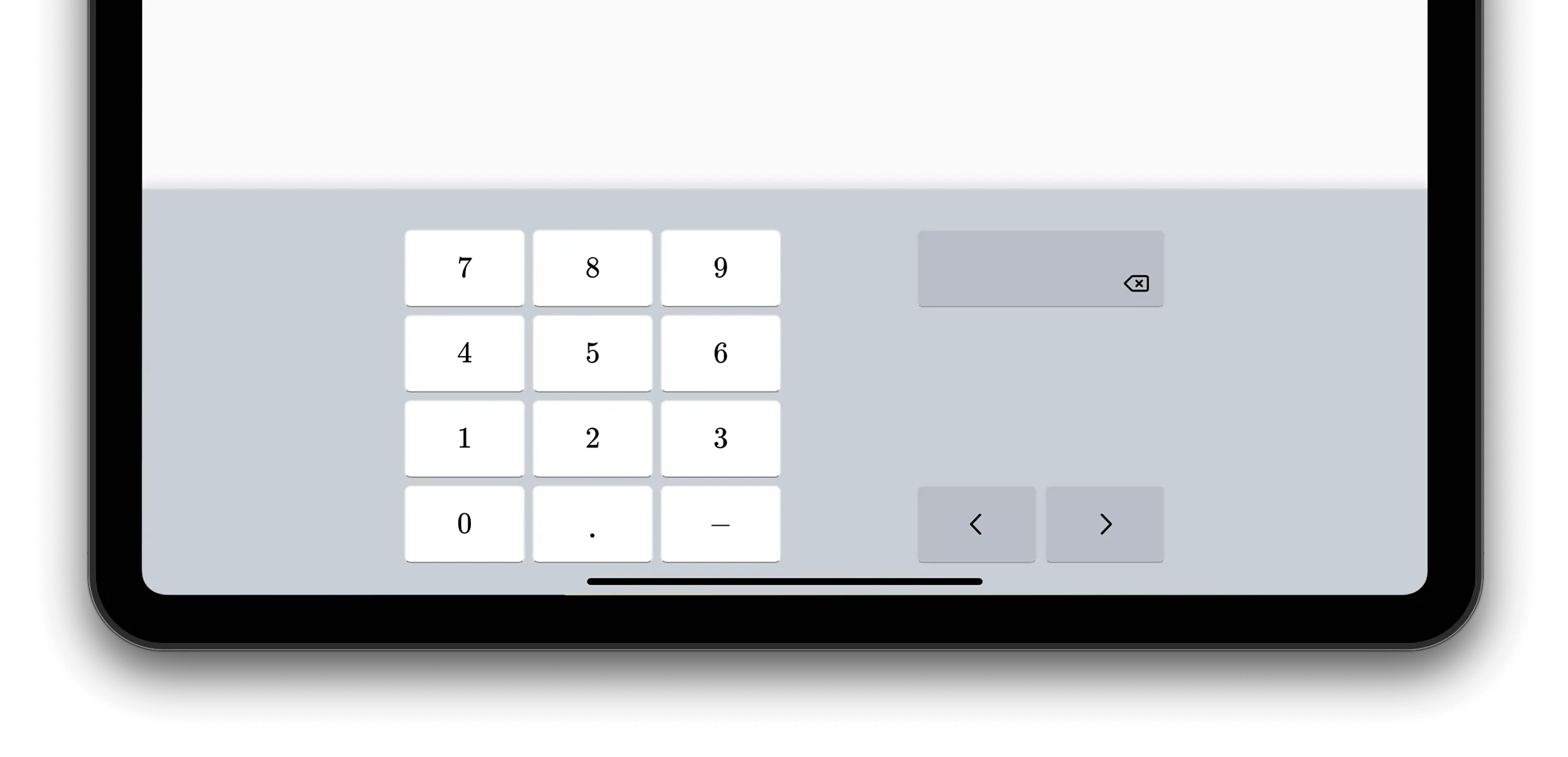
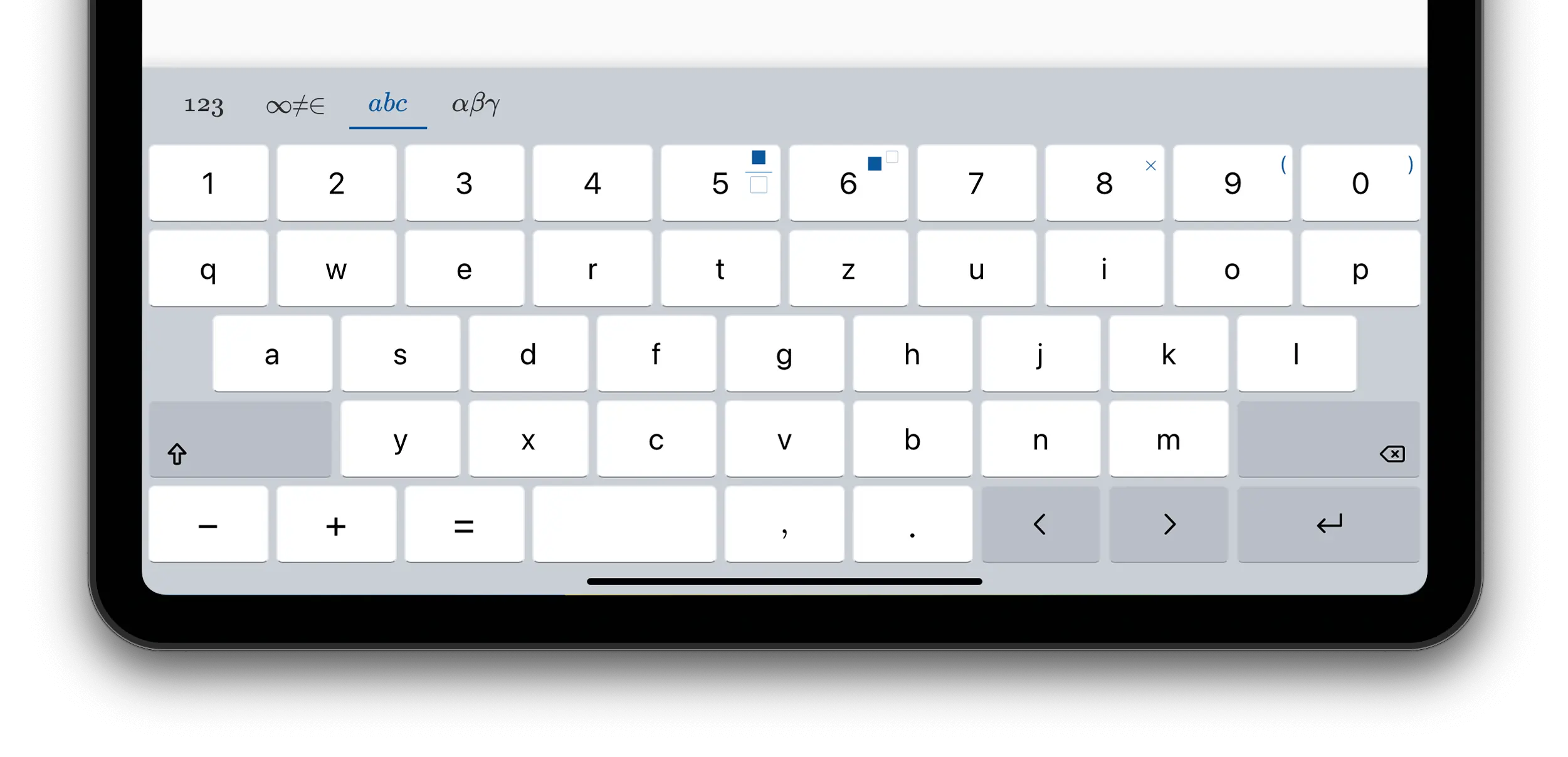
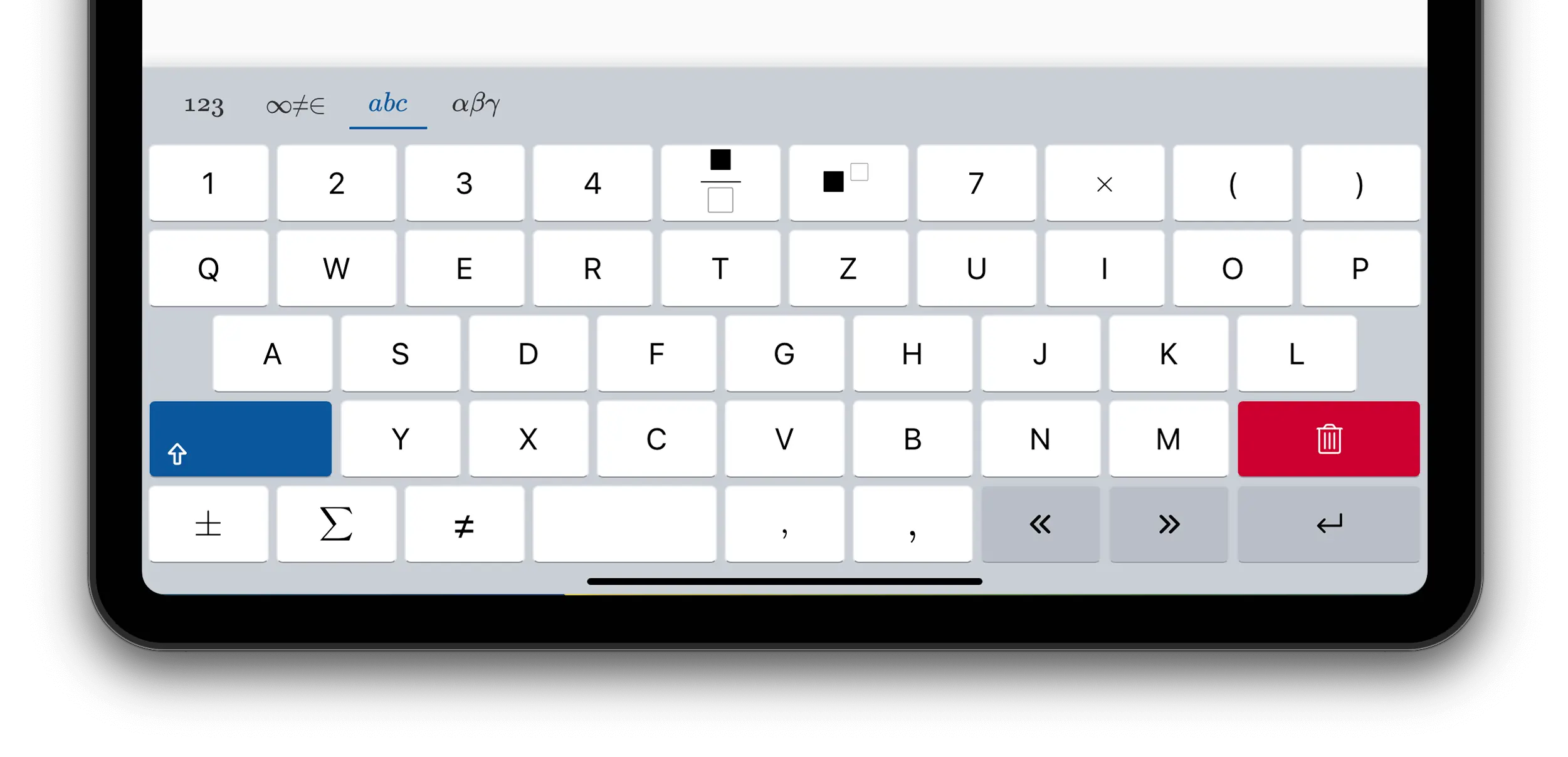
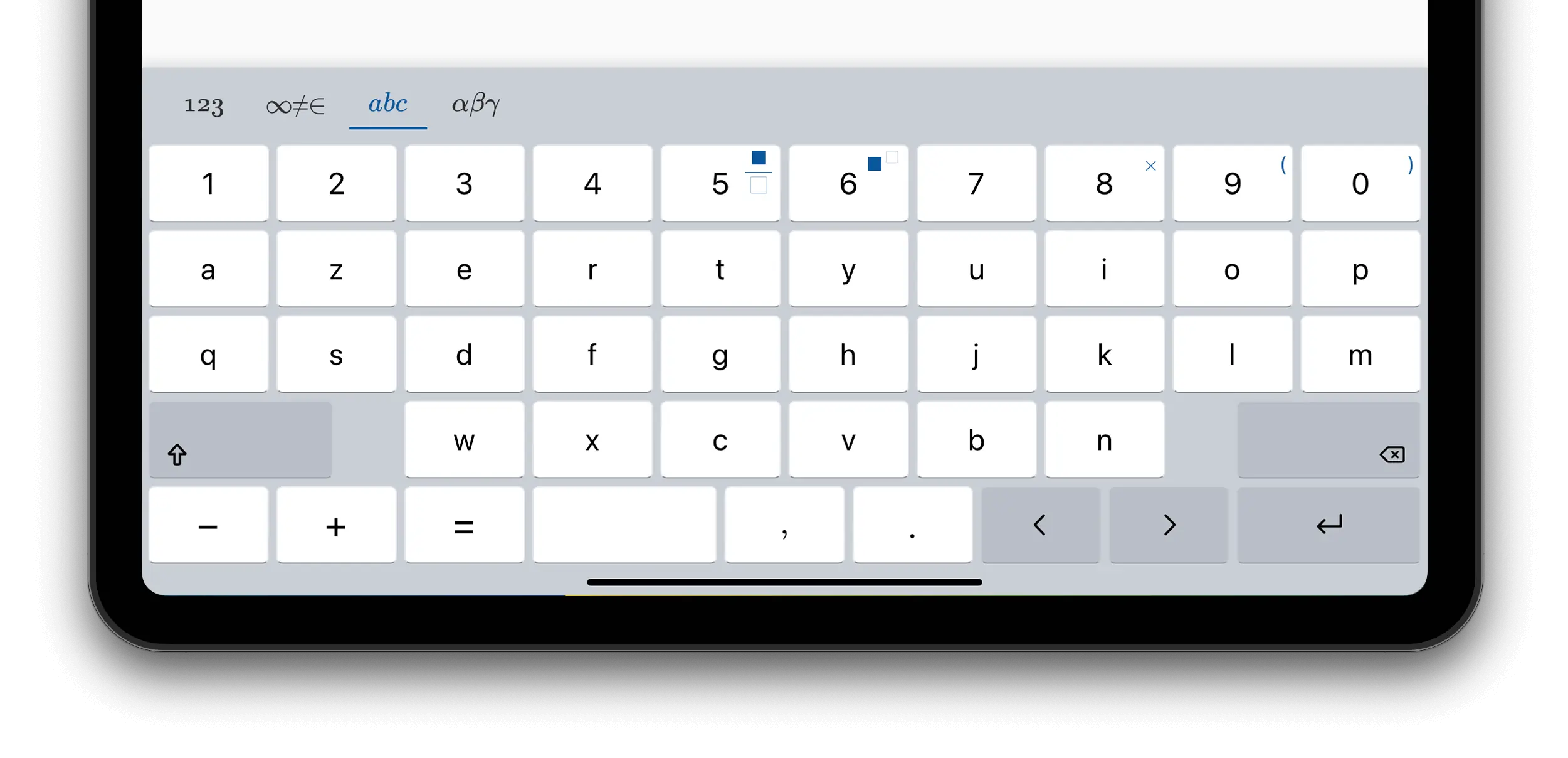
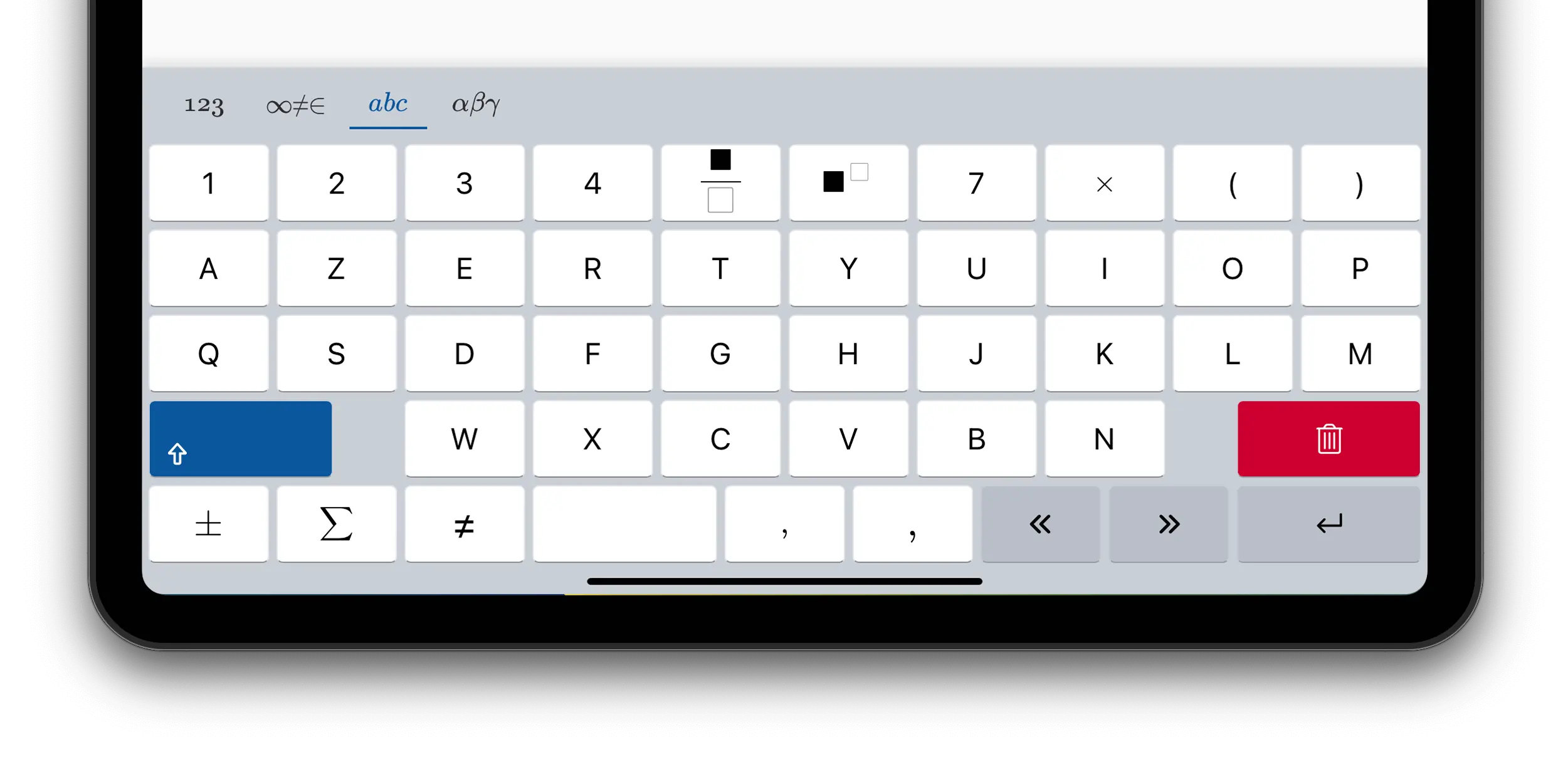
Customizing the Layouts
The virtual keyboard panel displays multiple layouts which can be
toggled using the layout switcher: numeric, symbols, alphabetic
and greek.
To choose which layouts are listed in the layout switcher, use the
mathVirtualKeyboard.layouts property.
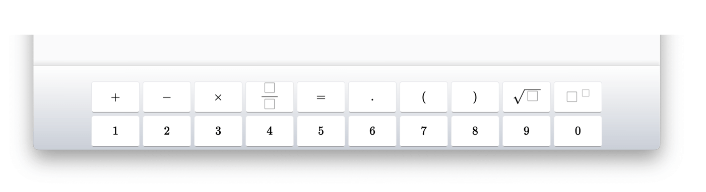
For example, to only show the numeric and symbols layouts, use:
<math-field>x=\frac{-b\pm \sqrt{b^2-4ac}}{2a}</math-field>
document.querySelector('math-field').
  addEventListener('focus', () => {
    mathVirtualKeyboard.layouts = ["numeric", "symbols"];
    mathVirtualKeyboard.visible = true;
  });
To revert to the default layouts, use:
mathVirtualKeyboard.layouts = "default";
Different Layouts for Multiple Mathfields
There is a single instance of the virtual keyboard panel, shared by all mathfields. The layouts are shared by all mathfields as well.
To display a different set of layouts for a specific mathfield, change the
mathVirtualKeyboardLayouts property of the mathfield when it is focused.
// Layout for mathfield mf1
mf1.addEventListener("focusin", () => {
  mathVirtualKeyboard.layouts = ["numeric", "symbols"];
});

// Layout for mathfield mf2
mf2.addEventListener("focusin", () => {
  mathVirtualKeyboard.layouts = ["minimalist"];
});
Additional Layouts
In addition to numeric, symbols, alphabetic and greek, the
following layouts are available:
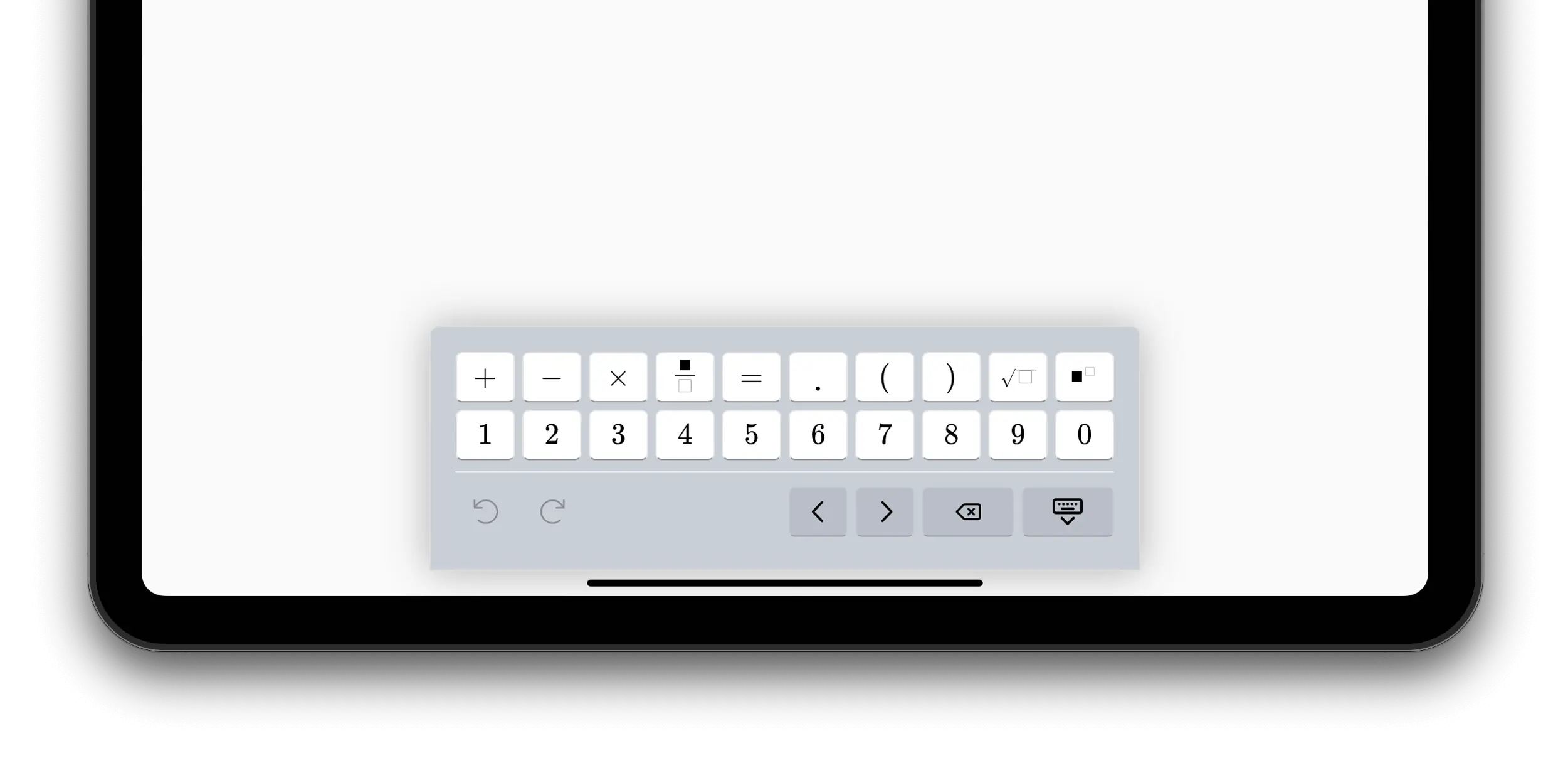
Minimalist Layout
The "minimalist" layout is focused on entry of simple expressions.
mathVirtualKeyboard.layouts = ["minimalist"];
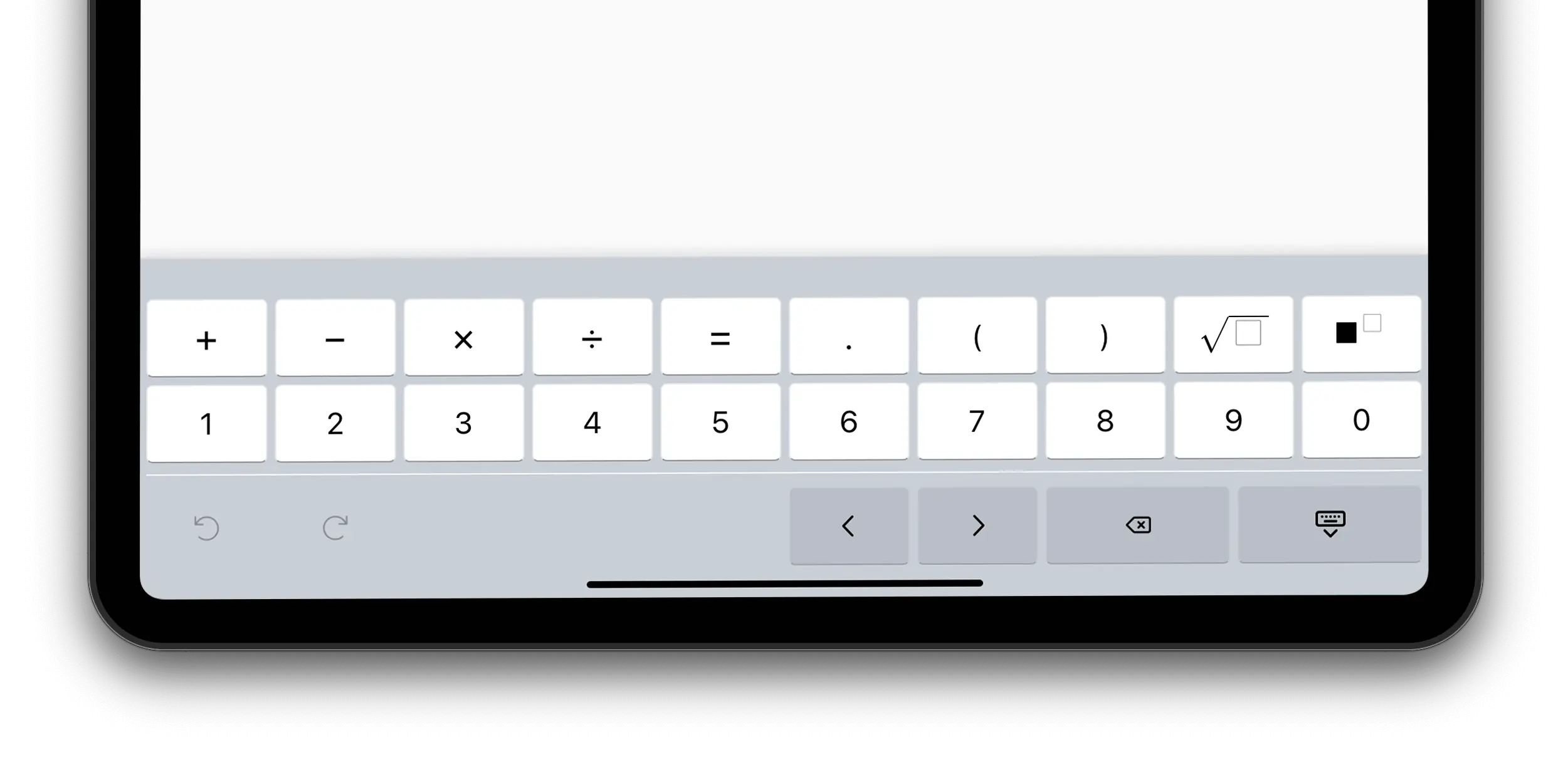
Compact Layout
The "compact" layout is similar to "minimalist" but the keycaps include variants.
mathVirtualKeyboard.layouts = ["compact"];
Numeric Only Layout
The "numeric-only" layout is suitable for input that is purely numeric.
mathVirtualKeyboard.layouts = ["numeric-only"];
Defining Custom Layouts
In addition to the built-in layouts, you can define your own layouts.
The simplest way to define a custom layout is to set mathVirtualKeyboard.layouts to an object
literal with a rows property, an array of keycaps.
For best result, you should make sure the rows have no more than 10 keycaps.
<math-field>x=\frac{-b\pm \sqrt{b^2-4ac}}{2a}</math-field>
document.querySelector('math-field').
  addEventListener('focus', () => {
    mathVirtualKeyboard.layouts = {
      rows: [
        [
          "+", "-", "\\times", "\\frac{#@}{#?}", "=", ".",
          "(", ")", "\\sqrt{#0}", "#@^{#?}",
        ],
        ["1", "2", "3", "4", "5", "6", "7", "8", "9", "0"],
      ]
  };
  mathVirtualKeyboard.visible = true;
});
Each keycap is a LaTeX string which is used both as the label of the keycap, and as the content inserted when the keycap is pressed.
Placeholder Tokens
You’ll notice from the example above that the LaTeX fragments defining the keycap can contain some special placeholder tokens:
| Token | |
|---|---|
#@ |
Replaced with the selection, if there is one. If there is no selection, replaced with an implicit argument to the left of the caret. For example, for 12+34, if the caret is at the end, #@ would be replaced with 34. |
#0 |
Replaced with the selection if there is one, a \placeholder{} command otherwise |
#? |
Replaced with a \placeholder{} command |
Keycap Shortcuts
The value of the keycap can be a LaTeX string, or one of the special values below, corresponding to a standard keycap. These shortcuts define the label, appearance, command when pressed, shifted command and variants for those keys.
"[left]" "[right]" "[return]" "[hide-keyboard]" "[shift]"
"[backspace]" "[undo]" "[redo]" "[cut]" "[copy]" "[paste]"
"[.]" "[+]" "[-]" "[/]" "[*]" "[=]"
"[(]" "[)]"
"[0]" "[1]" "[2]" "[3]" "[4]" "[5]" "[6]" "[7]" "[8]" "[9]"
"[separator]" ["hr"]
"[foreground-color]" "[background-color]"
Advanced Keycaps
For more control over the appearance and behavior of a keycap use an object literal with the following properties:
label: the label of the keycap, displayed using the system font. This can include some HTML markup, for example"<span><i>x</i> ²</span>". If property is absent, thelatexproperty is used for the label of the keycap. The label can also be one of the keycap shortcuts mentioned above, e.g.[left]. If a keycap shortcut is used, the other properties override the values defined by the shortcut.latex: if nolabelis provided, the value of thelatexproperty is used as the label of the keycap. This property is also used to insert content in the mathfield when the keycap is pressed.key: if present, when the keycap is pressed the corresponding physical keyboard key is simulated, potentially triggering keyboard shortcuts.insert: if present, a LaTeX string to be inserted when the keycap is pressed.command: the command to perform when the keycap is pressed. For example:["performWithFeedback", "commit"].class: a set of CSS classes to style this keycap. The classes can be custom defined (see below about thestylelayer property), or be one or more of the standard ones:tex: use the TeX font for its label. Using thetexclass is not necessary if using thelatexproperty to define the label.ghost: the keycap with no border or backgroundsmall: display the label in a smaller sizeaction: an “action” keycap (for arrows, return, etc…)bottom,left,right: alignment of the labelhide-shift: do not display the shift top-right label on the keycap if ashiftproperty is provided.
width: the width of the keycap, as a multiple of a standard keycap. That is, 0.5 for half-wide keys, 1.5 for one and half wide keys, etc…aside: an optional small label displayed below the keycap. This label may not be displayed if the space available is too small.shift: a LaTeX string or a keycap record indicating what happens when this keycap is pressed with the SHIFT key down.variants: an array of keycaps (either as string or keycap records) defining the variants for this keycap (see below).
If neither insert nor command are provided, the latex or key properties
are used to define the content inserted when the keycap is pressed.
Here’s an example of a basic keyboard layout:
mathVirtualKeyboard.layouts = {
  label: 'Basic',
  rows: [
    [
      '[7]', '[8]', '[9]', '[+]',
      { label: '[separator]', width: 0.5 },
      { class: 'small', latex: '\\frac{#@}{#0}' },
      '\\varnothing', '\\infty', '\\in', '\\notin',
      '[separator]',
    ],
    [
      '[4]', '[5]', '[6]', '[-]',
      { label: '[separator]', width: 0.5 },
      '[(]', '[)]', '\\lt', '\\le', '\\hat{=}', '[separator]',
    ],
    [
      '[1]', '[2]', '[3]', '\\cdot',
      { label: '[separator]', width: 0.5 },
      '[', ']', '\\gt', '\\ge',

      { label: '[backspace]', width: 2 },
    ],
    [
      { label: '[0]', width: 2 }, '[.]', '\\colon',
      { label: '[separator]', width: 0.5 },
      '\\lbrace', '\\rbrace', '=', '\\ne', '[left]', '[right]',
    ],
  ],
};
Keycap Variants
The default layouts include variants for many of their keycaps. These variants are accessed with a long press on the keycap. The variants are typically related, but less frequently used version of the main keycap.
You can define variants for a custom layout by specifying a variants
property with the definition of a keycap. The value of the variants property
is an array of VirtualKeyboardKeycap. As a shortcut, a string can also be
used, which is equivalent to a VirtualKeyboardKeycap with a latex property
equal to the string, that is, it will display the latex string as the keycap
label and insert it when the key is pressed.
rows: [
  [
    { latex: "a", variants: ["A", "\\alpha", "\\Alpha"] }
    ...
  ]
]
Layer Styling
If you want to apply custom CSS classes to some keycaps, you can provide
a definition for them using the style property. Note that in that case
you can’t use the rows shortcut, you must provide the full definition
of the layers.
mathVirtualKeyboard.layouts = [
  {
    label: "minimal",
    tooltip: "Only the essential",
    layers: [
      {
        style: ".digit { background: blue; color: white }",
        rows: [
          [
            '+',
            '-',
            '\\times',
            '\\frac{#@}{#?}',
            '=',
            '.',
            '(',
            ')',
            '\\sqrt{#0}',
            '#@^{#?}',
          ],
          [
            { class: 'digit', latex: '1' },
            { class: 'digit', latex: '2' },
            { class: 'digit', latex: '3' },
            { class: 'digit', latex: '4' },
            { class: 'digit', latex: '5' },
            { class: 'digit', latex: '6' },
            { class: 'digit', latex: '7' },
            { class: 'digit', latex: '8' },
            { class: 'digit', latex: '9' },
            { class: 'digit', latex: '0' },
          ],
        ],
      },
    ],
  },
  "alphabetic",
];
Multiple Layers
Most keyboard layouts are made of a single layer. However, if your layout
includes multiple layers, use the layers property to provide an array of
layers.
mathVirtualKeyboard.layouts = {
  layers: [
    {
      rows: [
        [
          "+", "-", "\\times", "\\frac{#@}{#?}", "=", ".",
          "(", ")", "\\sqrt{#0}", "#@^{#?}",
        ],
      ]
    },
    {
      rows: [
        ["1", "2", "3", "4", "5", "6", "7", "8", "9", "0"],
      ]
    }

  ],
};
Multiple Layouts
You can also mix default layouts with your own. For example, to add the alphabetic layout after your own:
mathVirtualKeyboard.layouts = [
  {
    label: "minimal",
    tooltip: "Only the essential",
    rows: [
      [
        "+", "-", "\\times", "\\frac{#@}{#?}", "=", ".",
        "(", ")", "\\sqrt{#0}", "#@^{#?}",
      ],
      ["1", "2", "3", "4", "5", "6", "7", "8", "9", "0"],
    ]
  },
  "alphabetic"
];
If you include more than one layout, it’s a good idea to provide a label and tooltip so they get propertly displayed in the layout switcher.
Customizing the Appearance of the Virtual Keyboard
To customize the appearance of the virtual keyboard panel set the following
CSS variables on a selector that applies to the container of the virtual
keyboard panel, which is the <body> element by default:
body {
  --keyboard-zindex: 3000;
}
You can also set these CSS variables programmatically:
document.body.style.setProperty("--keyboard-zindex", "3000");
Customizing the Virtual Keyboard Stack Order
To specify the stack order of the virtual keyboard relative to
other DOM elements set the --keyboard-zindex CSS variable.
The default zindex of the virtual keyboard is 105.
Customizing the Virtual Keyboard Colors
To control the appearance of the virtual keyboard text and background colors, set the value of the following CSS variables to a CSS color:
-
--keyboard-accent-color -
--keyboard-toolbar-text -
--keyboard-toolbar-text-active -
--keyboard-toolbar-background -
--keyboard-toolbar-background-hover -
--keyboard-toolbar-background-selected -
--keycap-background -
--keycap-background-hover -
--keycap-background-active -
--keycap-background-pressed -
--keycap-border -
--keycap-border-bottom -
--keycap-text -
--keycap-text-active -
--keycap-text-hover -
--keycap-text-pressed -
--keycap-shift-text -
--keycap-shift-color -
--keycap-primary-background -
--keycap-primary-text -
--keycap-primary-background-hover -
--keycap-secondary-background -
--keycap-secondary-background-hover -
--keycap-secondary-text -
--keycap-secondary-border -
--keycap-secondary-border-bottom -
--box-placeholder-color -
--variant-panel-background -
--variant-keycap-text -
--variant-keycap-text-active -
--variant-keycap-background-active
The following CSS variables are a border shorthand value:
--keyboard-border--keyboard-horizontal-rule
Customizing the Size of the Keyboard
By default the virtual keyboard is sized so that it can be used comfortably on touch-devices. Its size will adjust based on the available space in its container, which is the viewport by default.
However, you may want to have a more compact virtual keyboard to leave more
room for the content. You can control the appearance of the virtual keyboard
using some CSS variables. Set those variables in a rule that applies to
the entire document, for example the body element selector.
body {
  --keycap-height: 24px;
  --keycap-font-size: 16px;
  --keycap-shift-font-size: 9px;
  --keycap-small-font-size: 9px;
  --keycap-extra-small-font-size: 9px;
  --keyboard-toolbar-font-size: 16px;
  --keycap-gap: 1px;
}
The following CSS variables can be used to adjust the layout:
-
--keycap-height -
--keycap-max-width -
--keycap-gap -
--keycap-font-size -
--keycap-shift-font-size -
--keycap-small-font-size -
--keycap-extra-small-font-size -
--keycap-secondary-border-bottom -
--keycap-secondary-border-bottom -
--keyboard-toolbar-font-size -
--keyboard-padding-horizontal -
--keyboard-padding-top -
--keyboard-padding-bottom -
--keyboard-row-padding-left -
--keyboard-row-padding-right -
--variant-keycap-length -
--variant-keycap-font-size -
--variant-keycap-aside-font-size
Preventing Input from the Physical Keyboard
To require the virtual keyboard to be used for input and ignore
keys pressed on the physical keyboard listen and preventDefault() on "keydown"
events during the capture phase, and show the virtual keyboard when the mathfield
is focused.
mf.addEventListener("keydown", (evt) =>
  evt.preventDefault(), { capture: true });

mf.addEventListener("focus", () =>
  mathVirtualKeyboard.show());
Displaying the Virtual Keyboard in a Custom Container
By default the virtual keyboard is inserted at the end of the document’s body
element.
In some cases you may want to display the virtual keyboard in some other container.
For example when using full screen elements that contain a mathfield, you want to make sure the virtual keyboard panel is visible by attaching it to the full screen element.
To select which DOM element the virtual keyboard is attached to, set the
mathVirtualKeyboard.container property to the desired DOM element.
The container element should be at least 320px wide to ensure that the default layouts can fit. The height of the container element will be adjusted so that the virtual keyboard can fit.
Reacting to the Virtual Keyboard Geometry Changes
The virtual keyboard panel is positioned relative to the container element
using the position: absolute CSS property. This means that the virtual
keyboard panel will not affect the layout of the container element.
However, the container element may need to adjust its layout to make room for the virtual keyboard panel. For example, if the container element is a full screen element, it may need to adjust its height to make room for the virtual keyboard panel.
To react to the geometry changes of the virtual keyboard panel, listen
to the "geometrychange" event on the mathVirtualKeyboard object.
The bounding rectangle of the virtual keyboard is available in the
mathVirtualKeyboard.boundingRect property.
For example, to adjust the height of the container element to make room for the virtual keyboard panel:
mathVirtualKeyboard.addEventListener("geometrychange", () => {
  container.style.height =
    mathVirtualKeyboard.boundingRect.height + "px";
});
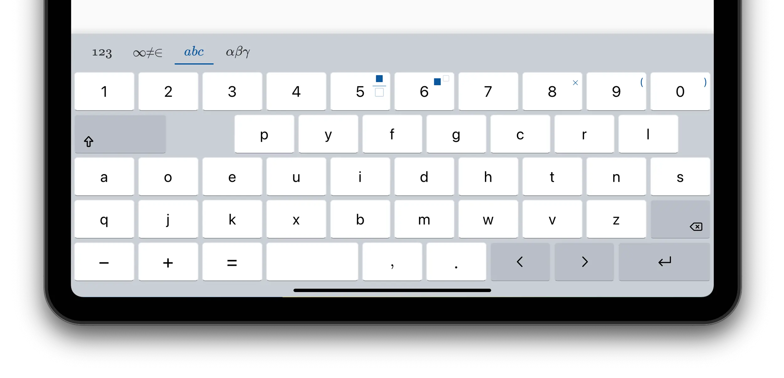
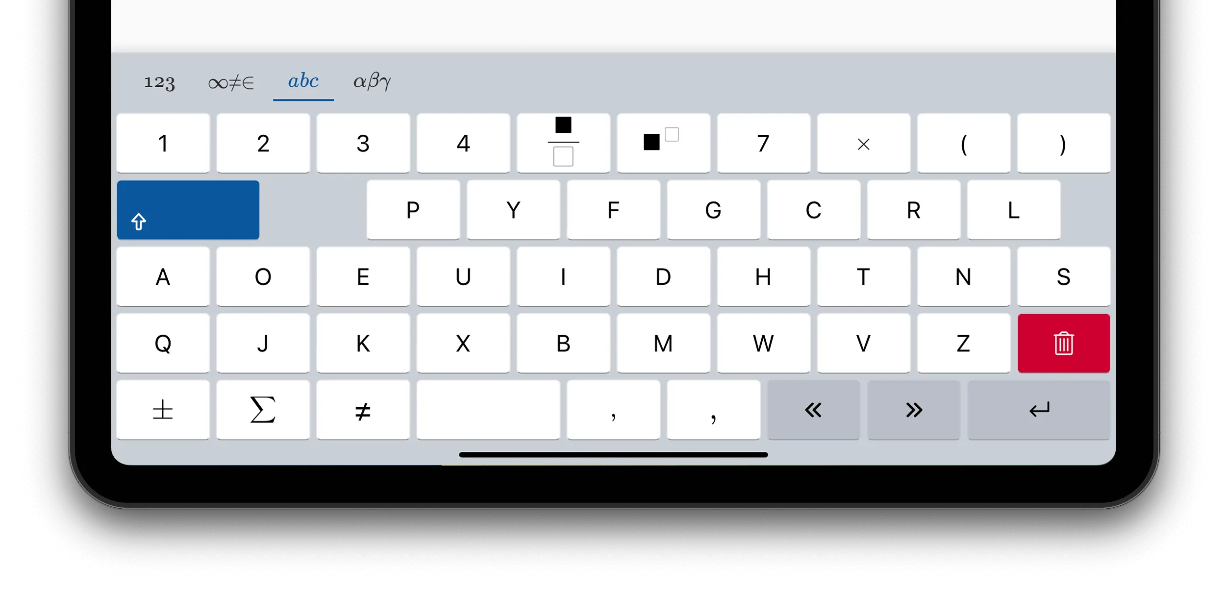
Customizing the Alphabetical Layout
By default the "alphabetic" layout is determined based on the locale (QWERTY
for english speaking countries, AZERTY for french speaking
countries, etc…).
To select a different alphabetic layout, such as DVORAK or COLEMAK,
use the mathVirtualKeyboard.alphabeticLayout property.
const mf = document.querySelector('math-field');
document.querySelector('math-field').addEventListener('focus', () => {
  mathVirtualKeyboard.layouts = ["alphabetic"];
  mathVirtualKeyboard.alphabeticLayout = "dvorak";
  mathVirtualKeyboard.visible = true;
});
<math-field>x=\frac{-b\pm \sqrt{b^2-4ac}}{2a}
</math-field>
QWERTZ Layout
AZERTY Layout
DVORAK Layout